Half-Earth Socialism (The Game)
For the past year I worked on Half-Earth Socialism, an online game accompanying the book of the same name by Drew Pendergrass and Troy Vettese (Verso 2022). The game launched at the beginning of May; you can play it here. This post will make more sense after you’ve played the game!
This post is adapted from a talk I gave at Trust (who organized the project) and goes a bit into the design and development process of the game.
Genesis
Trust was approached early in 2021 about developing a website to accompany the forthcoming book Half-Earth Socialism, which would be published a little more than a year later. To very, very briefly summarize the book (the book itself is a quick read so I encourage you to give it a look!): the authors focus on land use as the central variable of concern for the health of the planet (hence the name “Half-Earth” socialism, building off of E.O. Wilson’s idea of the same name) and emphasize the need for rational democratic planning to make decisions around the future of the world. For example: how much land should be devoted to energy production, and how much to food?
Democratic planning requires some way for people to meaningfully engage with plans: to understand them, evaluate them, and make their own plans. The original proposal for the site was based around a linear programming calculator where people could play with the parameters of a model that Drew wrote. I imagined it as something akin to Chris Crawford’s Balance of the Planet (1990), where the player is similarly adjusting parameters of a global model to influence planetary health.
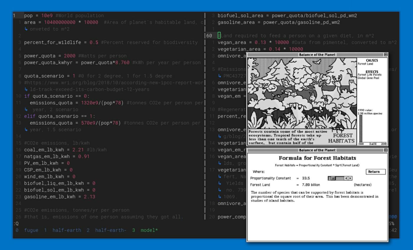
In this original version you could choose your energy mix, energy use levels, meat consumption, and so on. The model would figure out the allocation of land, emissions, and so on that were required. Using this model you can easily compare results and see, for example, that veganism opens up quite a lot of land for energy production. But part of the book’s appeal is the vignettes throughout that imagine what life might be like under Half-Earth socialism or what it might be like were it not to happen. We wanted to take this model and build a richer, more narrative experience around it to reflect some of the feeling those vignettes evoked: the pacing of such a world, people’s concerns and values, and the social fabric of their lives.
Reading Group
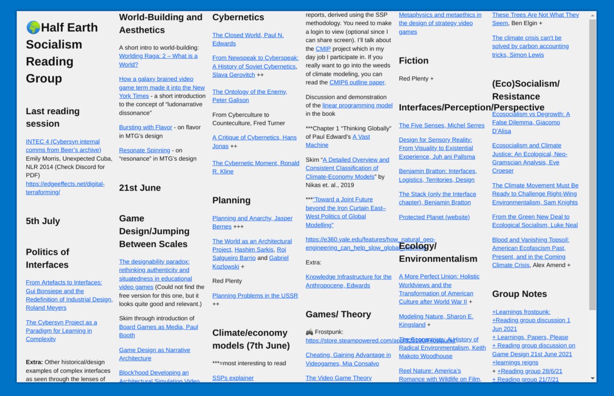
Before any development began we first participated in a reading group, organized by Chiara Di Leone, covering topics like: socialist cybernetics, cybernetic planning, complex systems management interface design, climate modeling, and games that we found interesting or related to the these topics. These helped us coalesce on a set of mechanics, design elements, constraints, and feelings to develop the game around.
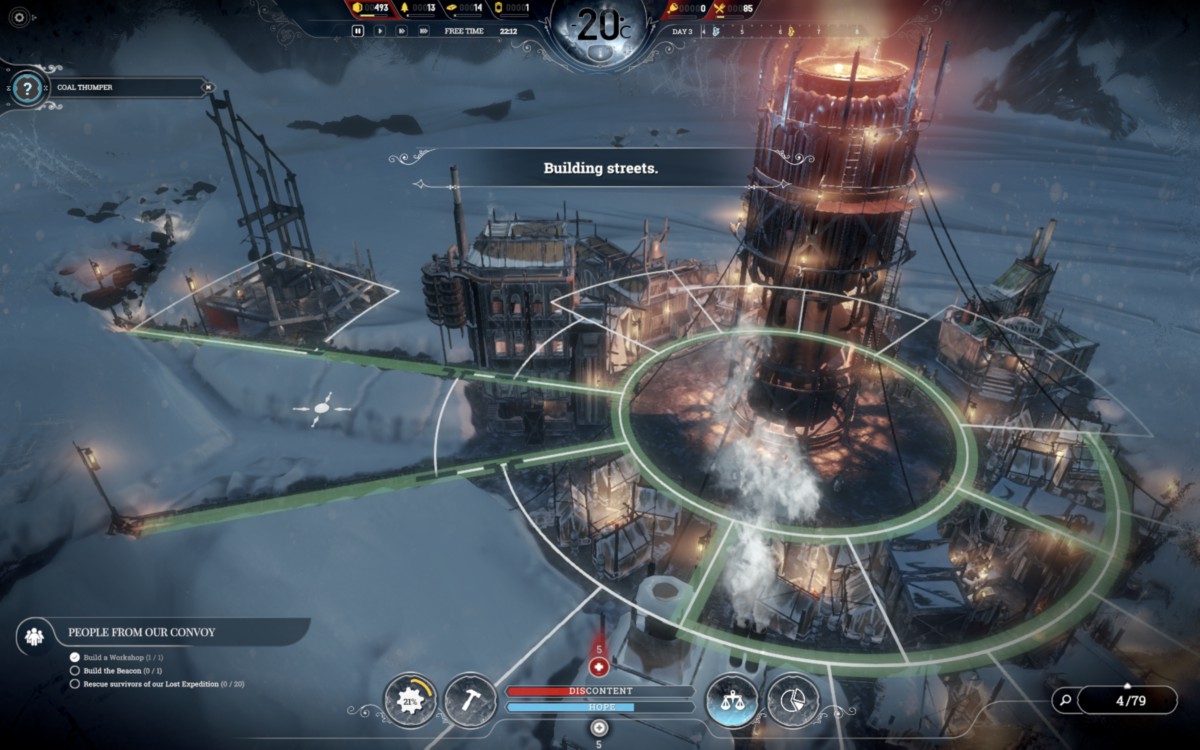
Two games that we looked closely at were 11 Bit Studio’s Frostpunk and Nerial’s Reigns. Frostpunk’s gameplay is centered around one primary variable (heat) and is filled with many brutal, no-win policy decisions around managing morale. The game is really well organized around its primary variable–it’s very easy to see how heat is distributed, what’s producing it, how it decays, and so on, so even though the decisions can be difficult, you’re seldom disoriented or confused about what your priorities are. The game is, however, very dark and depressing. In contrast to Half-Earth Socialism’s more utopian outlook, Frostpunk is a never-ending crisis. We knew that we wanted our game’s arc to be different: the beginning is a difficult struggle to get through, but if you do well the game opens up into a world better than the pre-crisis past. There’s light on the other side!
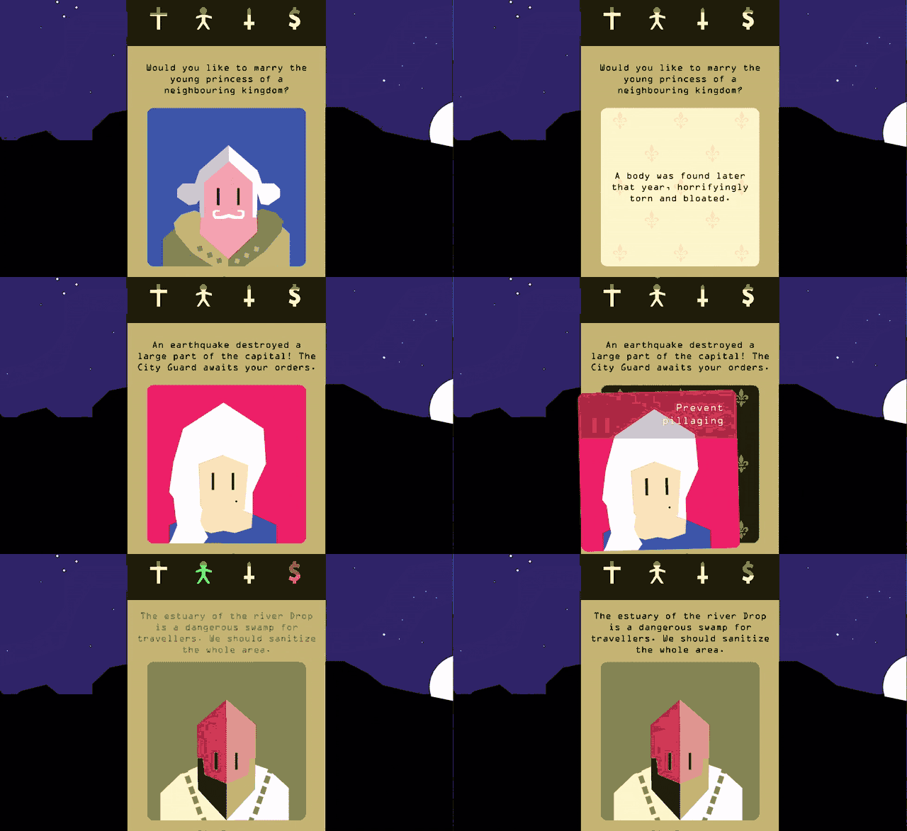
We knew early on that we wanted the game to be a web game, keeping in line with the original website idea and making sure that it’s easy to access. If you’re making a web game then you really need to consider mobile usage. We expected that most people would share the game on Twitter and thus others would likely encounter it on their phones and want to give it a try right there. That assumption’s held: the majority of plays so far have been on mobile resolutions. Reigns was a main inspiration of how you could make a simple yet deeply engaging game for mobile. It has one main interaction–swiping left or right–but it’s enough to support a great branching narrative. It’s also very flexible in terms of time commitment: you can play a session for a few minutes or an hour if you want. That’s something we wanted to replicate in our game–players could finish a run in 5 to 10 minutes, do something else, and come back and try a different approach later. That isn’t how things turned out (people have spent 30 minutes just reading the starting cards) and in the end the scope of our game was just too complex to really reproduce these elements of Reigns.
From the whole reading group process came a few orienting values:
- Accuracy: Most games prioritize a fun and engaging experience, and often systems that have real-world correlates are simplified in service of this priority. But because of the nature of the book and the weight of the subject, we wanted to prioritize rigor and accuracy a bit more than a typical game would. This was a huge challenge because representing something as complicated as the planet and human economic activity requires a great deal of simplification regardless of commitment to accuracy, and with the complexity of the planet and the global economy, details matter a lot. And often details that don’t seem to matter end up becoming quite important later on.
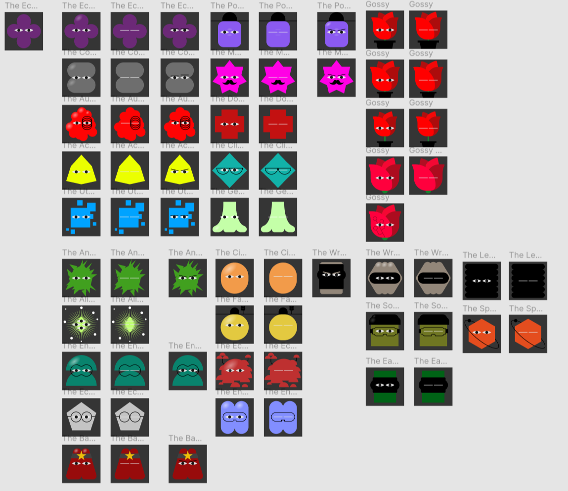
- Amusing: Climate change and ecological disaster are already very weighty topics without us needing to exaggerate it. We wanted to bring some levity to the game so that the player doesn’t feel pummeled by depressing thing after depressing thing (although it does kind of happen because of the subject matter). So using dialogue, character design, etc, as outlets to lower the “seriousness” of the game and leave plenty of space for the content to do that.
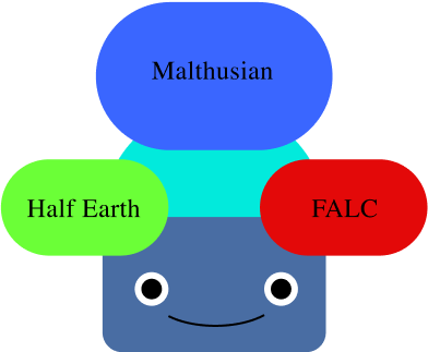
- Expressive: Another goal was for the game to play like a political compass quiz, in a way. We had a few player “builds” (above) in mind that made play feel expressive.
- Quick: Shorter games that you play in rapid succession, to try different things. I think originally we wanted a session to be 5-10min…but sessions last far longer now. It takes at least 5 minutes just to soak in the game’s starting content!
As mentioned above, take a cue from the book and convey the feeling of living under HES through dialogue and other narrative elements.
Development proceeded in roughly five categories:
- Story: the main beats of the game and game dialogue.
- Art Direction: character design, graphics, game feel, and so on.
- Game Design: the game’s primary mechanics and interactions.
- Legibility: the game’s information design, how players access/read the information they need to make decisions and how they make those decisions.
- Technical Requirements: various constraints around the game’s technical infrastructure and architecture
Story
We wanted to give the game world a richer feel through events, which give us opportunities to world-build and develop character personalities. They’re also one main way players get feedback about their plans. More importantly they allow us to represent way more than we could with the core game model alone, which focuses on a relatively limited set of variables (water usage, land usage, electricity production, fuel production, etc). With a very simple probability system we can represent a much wider range of events like mass coral bleaching events or cultural changes like a new cuisine trend of eating invasive jellyfish, without needing to make the model itself much more complex.
Of course, the events we have in the game pale in comparison to all the possible events one might think of for the future. They allow us to represent more detail than we could otherwise but open up an overwhelming amount of things we could represent. It’s one of those areas where we had to just stop adding things at some point, even though we probably could have added hundreds more.
Technical Requirements
Mobile and web support were the primary technical constraints, and those came with their usual challenges (mostly cross-browser compatibility). The more interesting technical requirements were related to the models and data that we needed.
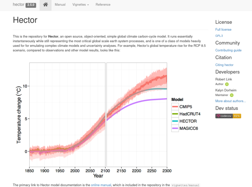
Early on we knew we wanted to have some kind of climate model running, but climate models are usually huge, requiring supercomputers long periods to run. Drew suggested Hector, which is a “simple climate model”. It runs quickly on commodity hardware, but of course lacks the depth and detail of its massive counterparts. From a technical standpoint I didn’t really want to have a server crunching a climate model for several players at once, even if it’s a relatively simple one. We managed to get it to run directly in the browser so that each player runs their own model independently.
We have some other models running too:
- a biome model, not running on mobile but on desktop, which colors the world according to temperature and precipitation changes over time.
- a linear programming model for determining production resource allocation and guided assistance in planning. This ended up being reduced to a much simpler form because there weren’t models available for the browser that handled the kind of optimization we needed.
The other major set of requirements were data requirements. For processes there were input requirements per unit output, impacts (e.g. CO2 emissions) per unit output, and current global process mixes. We also needed current emissions, current biodiversity loss, population projections aggregated for each region, global per-capita demand for each of our outputs, estimate per-capita impacts based on regional income levels, and impacts and inputs for different sectors/industries.
It’s often very difficult to track down good numbers for these. Data may be available at regional or national levels, but not globally. Or there may be a lot of variability in estimates. Some technologies like vertical farming and cellular agriculture are very new, so there are only estimates for very limited cases, if at all. For example with vertical farming we could only find a couple sources that on a one or two crops published by vertical farming startups (so very unclear how trustworthy the numbers are), and instead relied more on values from more general indoor greenhouse farming.
Art Direction
The game’s art direction is mostly Son La’s department but I’ll briefly mention my two main contributions.
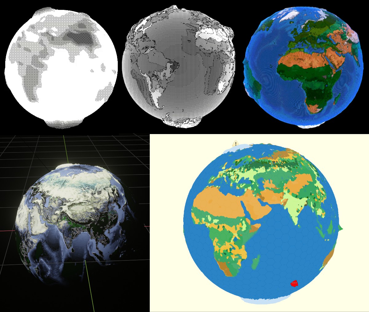
The first is the globe’s design, which took an embarrassingly long time (I’m really inexperienced with shaders). Our main aesthetic reference was a sort of retro-computing, so we played a lot with poorer color representation (dithering) and lower resolutions (pixelation).
The final version drew from this graphic that was produced for an article about the book:
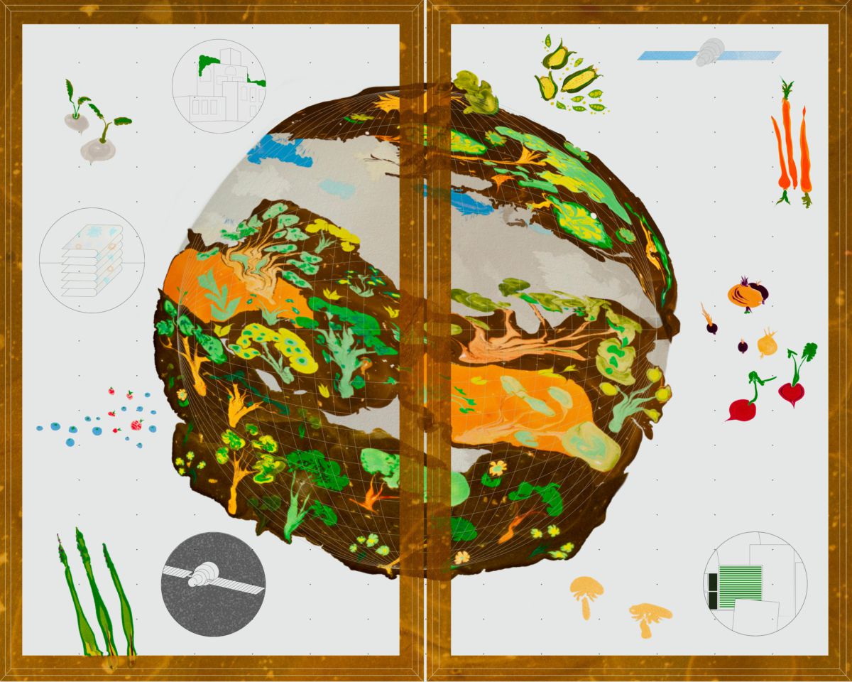
And here’s the final version:
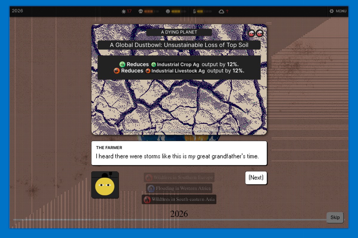
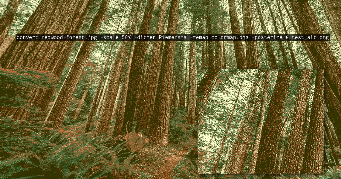
One major element of the game’s feel was the imagery we used to represent projects, processes, and events. We had a very small team, and it was really only Son La creating visual content (and also working on the UI development). We ended up with 238 events, 123 projects, 29 processes, 9 industries, and 20 regions, all of which needed images, so ~420 images total. There was no way we could create all of that on our own, so we looked at CC-licensed and public domain imagery. The problem with sourcing images that way is that they vary a lot in quality and style, and they kind of just look like digital photos. We played around with ways to process them so that they were more interesting and consistent and ended up with the following line:
Legibility
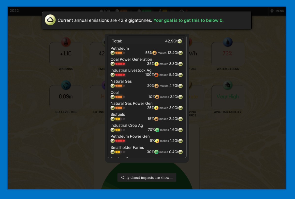
There is a lot to consider when assembling your plan and so a major challenge was making information available and clear to the player. All throughout the interface are tooltips and “factors” cards that breakdown what’s contributing to whatever variable you clicked on. The hope is that whatever info you need to make a decision is available quickly, but it still is and feels like a lot of information!
Game Design
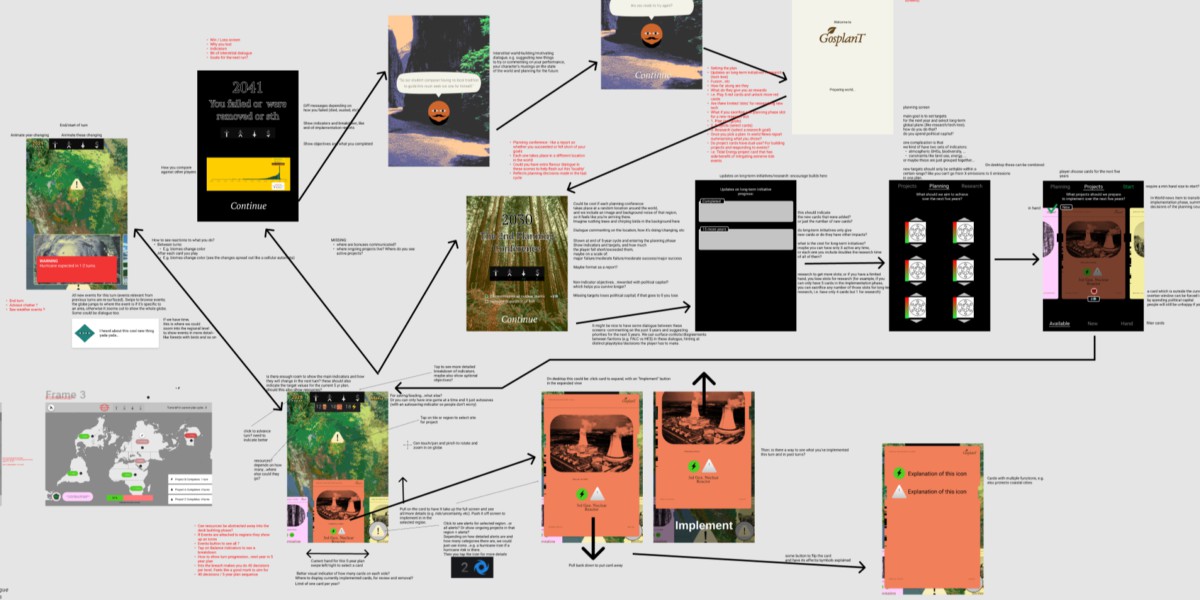
The most challenging part of the project was the game design. There were a lot of different things we wanted to communicate, different feelings we wanted to evoke, and so that led us down a few different design paths. But the biggest difficult was that the game is meant to somewhat accurately represent a set of very complex systems–we wanted some legitimacy and rhetorical weight behind what happens in the game. This commitment to accuracy of complexity is directly at odds with making an entertaining and accessible game. Most games are not complex in terms of their mechanics. Even games that are very deep do not have to be complex, and they often aren’t. Truly complex systems make for unfun games because they in their very nature inscrutable, so they become a very frustrating experience. You never quite know why something is happening: is it because of something you did, is it because of something you didn’t do, or did it have nothing to do with you at all? Part of what makes a game fun is learning its rules and systems, and one reasonably expects consistency, predictability, and legibility in how the game responds to your actions. Complex systems don’t care.
Balancing was also very difficult to do with such a complex game. We couldn’t anticipate all the paths or strategies a player might try. Ultimately we hoped to avoid players finding a strategy that works in the game that wouldn’t work in the real world because of some detail we left unmodeled, but it would require a lot more testing to have some assurance that we succeeded.
I’ll briefly describe two sets of ideas we had that I really liked but got cut for one reason or another.
Regional System
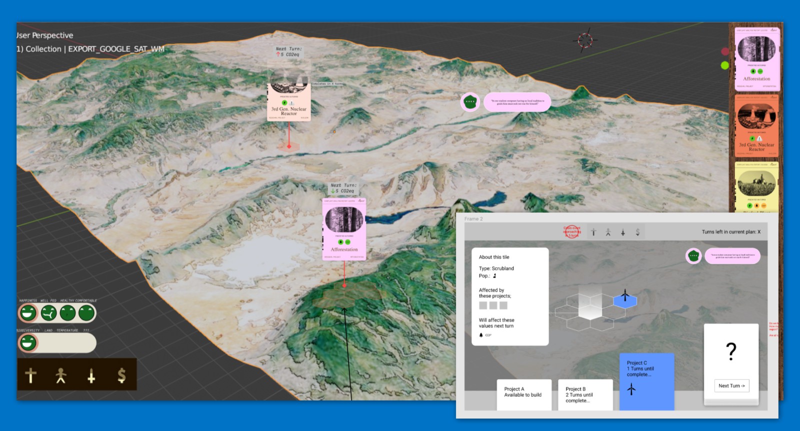
I remember “space” being a big concern. Given the book’s focus on land use, how we deal with space is really important. But it came in conflict with priorities like accuracy. Games might abstract space to make it more manageable, like using larger units of space which then reduces the level of detail you can represent spatially; or they might limit their focus e.g. to a single region or map or level. The earth is really big. We can’t really represent it in great detail without just blasting the player with stuff to manage. So we could limit the player’s focus at a given time to a single region. That’s basically where this design came from.
One bonus was the opportunity for more visual feedback/eye candy: you could zoom into a region and see wildlife return, to make your impacts on the world feel rewarding and more obvious.
But there was a more important game design element to this regional system. We wanted to avoid was the “god view” in games, where the player unilaterally makes decisions of all kinds, which is contra the democratic planning that’s emphasized in the book. It’s very challenging to design a game about global planning without making it a god game! Games are often fantasies of control…representing democracy in a game very difficult because it can disrupt that fantasy and make the game a frustrating experience. It’s interesting how certain kinds of friction are expected in a game, like a hard boss fight being difficult, but others, like having your decisions questioned or ignored, are not.
I don’t think we succeeded in avoiding the god view. The parliamentary system is supposed to represent that to some degree, and you can be ousted from power if you’re too unpopular. But that’s not quite the same as democratic planning. One iteration of this regional system idea had a greater and more autonomous role for individual regions (in the current game they mostly just exist to spatialize the game a bit, but they don’t really do much on their own). The player would set targets and maybe some specific policies/projects but regions would go and figure out how to achieve those targets on their own. There would be more bargaining with regions to accept targets or to achieve them in a particular way.
A further iteration on this idea–which was definitely out of reach given our constraints–was a multiplayer regional system. Different people play different regions, and perhaps elect one player to be a global planner for a term. The global planner mediates regional relationships: regions have to negotiate with one another, like if I’m representing East Asia I want North America to reduce their energy usage in exchange for reducing my coal usage or something.
Turn-based System
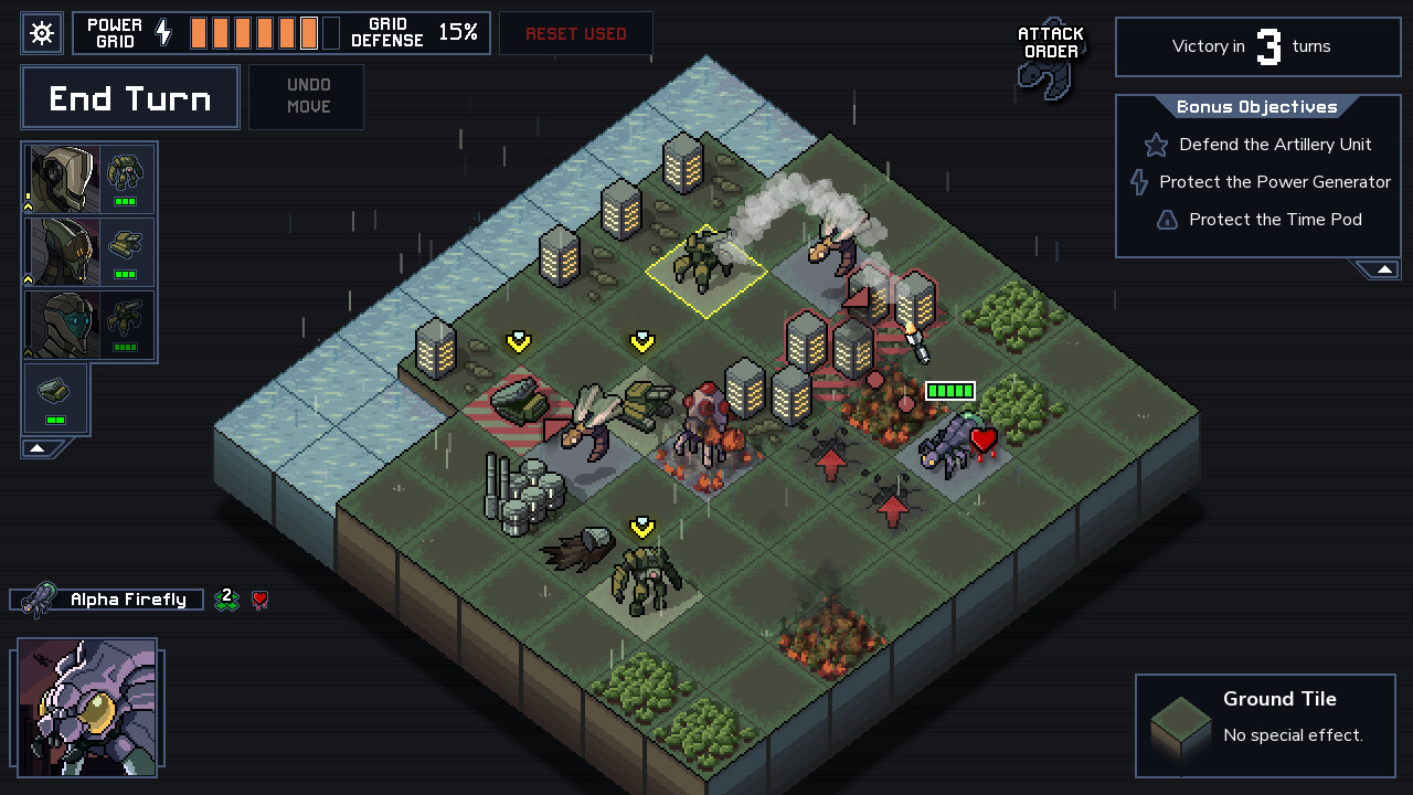
The other major concept was a turn-based game, similar to Into the Breach. Each turn is some fixed time amount, and you have a preview of everything that will happen in the next turn or next n turns. For example: this natural gas plant will emit this much methane next turn, this patch of permafrost has 50% chance of melting by next turn, this hurricane will move left 2 tiles next turn, etc. It doesn’t really work for the global scale, since you can’t deal with things like an individual power plant, but I still think you could make a fun and interesting game this way if you could get away with more simplifications. And it’s not clear what amount of time a turn should represent. The hurricane movement, for example, requires a much shorter turn time, but other decisions like building new power plants are better suited to turns of a year or more. Similarly, it’s not clear what the spatial resolution should be. How many hexagons should the globe be divided into? A hurricane and a power plant are on two different scales.
One advantage of this design was that scientific uncertainty can more easily be a bigger part of the game. That natural gas plant might emit this much methane, but you don’t really know without better sensors. That 50% estimate for that patch of permafrost is based on your best climate models, but if you invest in improving them and training more climate scientists you’d have a better estimate. In this way the benefits of good long-term planning manifest as “powerups” in a sense that make the shorter game loop easier.
Card System
We ended up settling on a card-based system. It felt more familiar and easier conceptually, giving players something to hold on to while we barraged them with other new information to absorb. Cards also provide a convenient way to compartmentalize “abilities” and a give players a discrete object to think with. Basically all player actions are expressed through manipulating cards in some way.
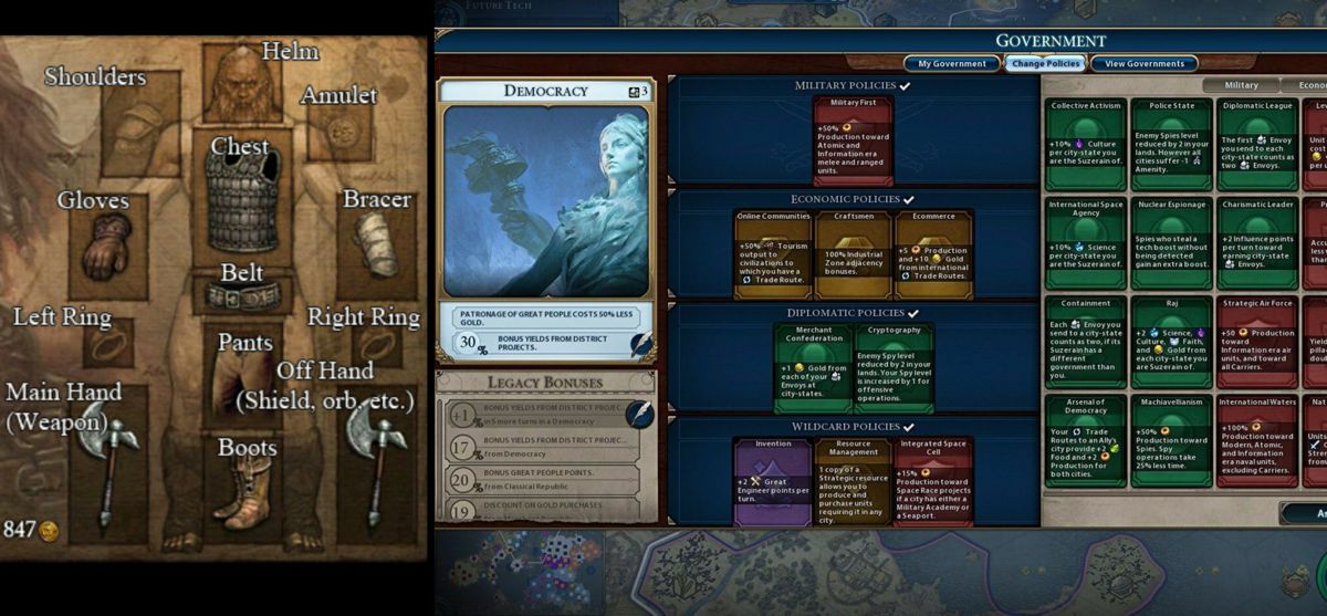
There are still a lot of ways to use cards. One idea was to have your plan be something like equipment slots in an RPG, like Diablo (on the left here). But instead of a head slot for your helmet you’d have a concrete slot for your concrete production technology, and another one for your transport policy, and so on.
This is kind of how it works in Civilization 6 (on the right). This form ended up being too limiting because there are many projects we wanted to include that don’t fit neatly into an existing slot, thus requiring many single-purpose slots, and just making the whole thing clunky and confusing.
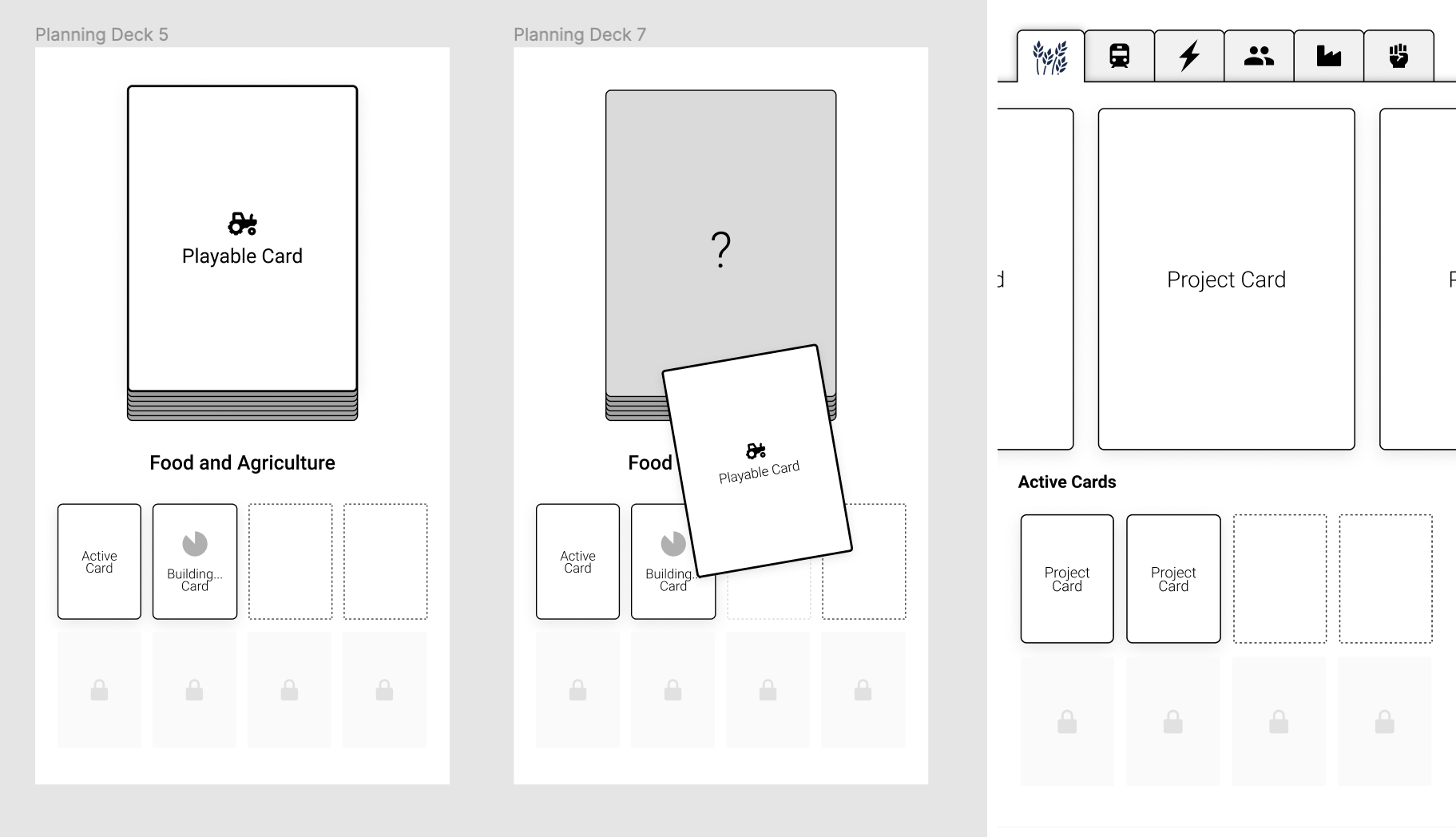
Above are a couple other ideas—on the left we have something based around a deck. One idea was that your “plan” is a deck of cards that you assemble and use to react to events, under the idea that a good plan prepares you for the future. So if your scientists are telling you a major heatwave is likely, you’d have a mass cooling center policy prepared to respond to that heatwave, if it does happen.
This ended up not really working because it feels like busywork for the player—you’re making two redundant decisions, the decision to establish the cooling centers, and the decision to use them when the heatwaves occurs. In trying to minimize extra actions, we’d assume that if you have the cooling centers in place, you’d want to use them.
Above is one of our prototypes for card interactions. This one is a Reigns-like interface, with four directions instead of two. We ditched it because as I mentioned the Reigns reactive playstyle didn’t quite fit what we needed.
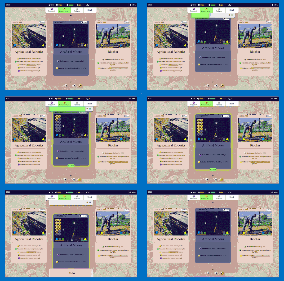
We settled on this “scanning” interaction, which has a retro computing punchcard-like vibe. Conceptually this is like the deck idea without the redundancy: in a way you’re scanning cards to add them to your deck (plan) so they make bad future events less likely.
We also wanted to add a political aspect to the game, in part to make gameplay more interesting (the player can’t just do everything they want to do–to lessen the “god view” problem) and also add some drama and an opportunity to develop the world through some strong personalities. They also give players some scaffolding to develop playstyles. There’s more clear guidance on what an accelerationist might want, for example, to nudge the player towards using those cards. The parliament system was also conceived to bring some of the “democratic” side of “democratic planning”, but I don’t think we succeeded in that. It’s my main regret of the game. I feel that we would have needed to design the game very differently for that to have worked, and at that point it was too late to make such major changes.
Tooling
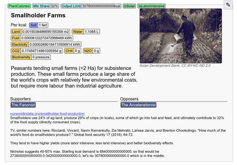
One last thing I want to show off is the Half-Earth editor, where all the content (dialogue, events, regions, projects, processes, and so on) and model parameters are written. Whenever I embark on a project like this, one of the first things I do (once the main architecture/schemas are sorted out) is build content authoring tools. It makes later work much quicker, makes it easier to experiment with the content, helps me think through more ideas and possible conflicts in that level of the design, and makes it much easier to bring on others (like writers/researchers Lucy Chinen and Spencer Roberts) to contribute without needing to muck about in the code.
Final note
Half-Earth Socialism was one of the bigger projects I’ve worked on, and I’m proud of what we accomplished with such a small team. Our ultimate ambition was way beyond our capacity and resources, but we managed to achieve quite a lot of it. The game was made possible because of these people:
